FeaturesBuildTheme Styles & design system
A design system that keeps every page consistent
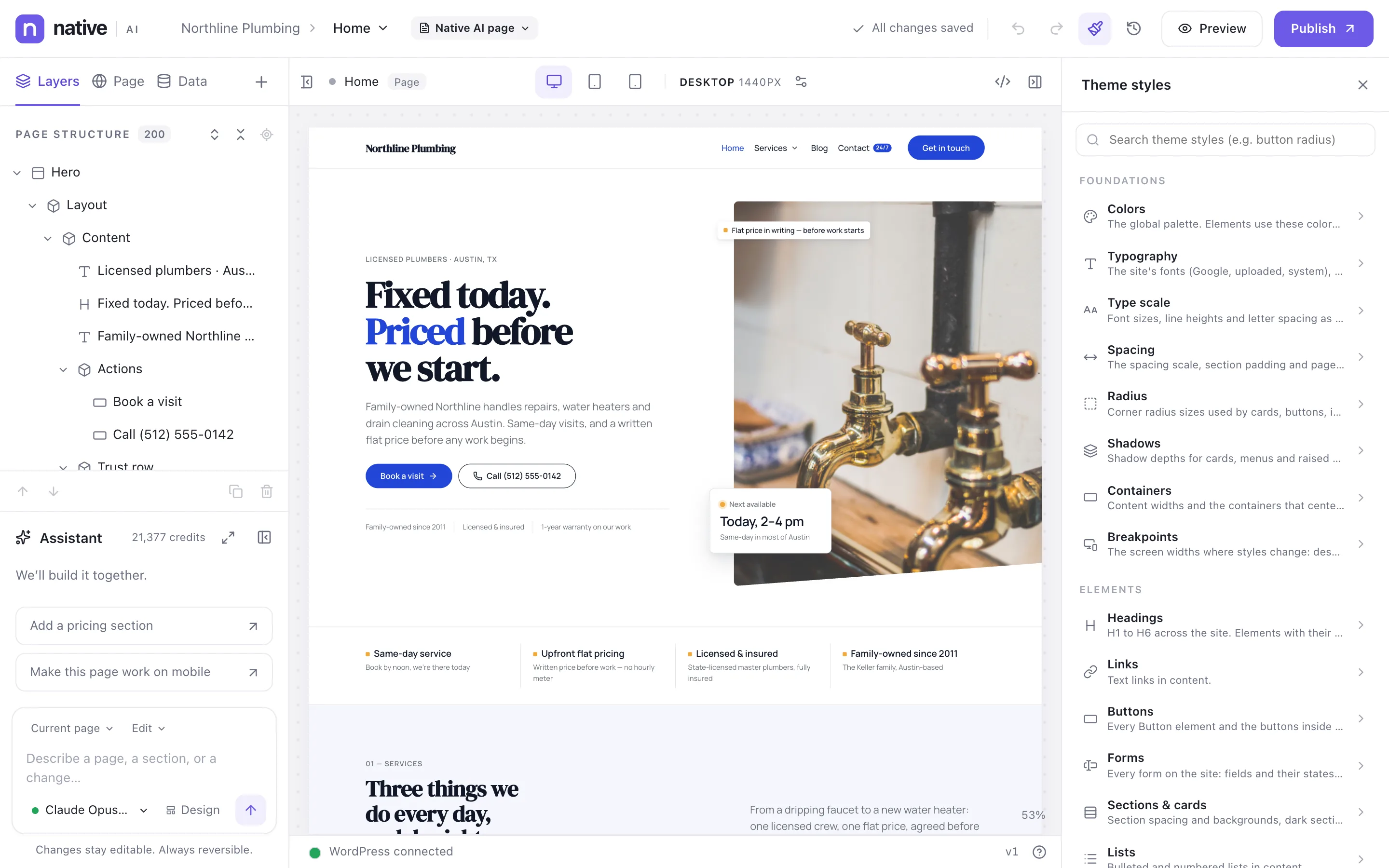
Theme Styles hold the site’s foundations — colors, typography, type scale, spacing, radius, shadows, containers, breakpoints — and the default look of every element: headings, links, buttons, forms, sections and cards, lists. Tokens and classes make the system reusable: change one and every page that uses it follows. The AI builds with the same system.
- Foundations and element defaults in one panel
- Tokens and classes with usage counts
- The full Google Fonts library, system fonts or your own
Foundations first
Colors are named by purpose — primary, accent, ink, muted text, surfaces, lines, dark sections — so a new color scheme is a few edits, not a hunt through pages. Typography sets the fonts; the type scale sets sizes, line heights and letter spacing for every level.
Spacing, radius, shadows and containers finish the foundation: section padding, content widths, card corners.
- Colors, typography, type scale, spacing, radius, shadows, containers, breakpoints
- Search Theme Styles by name (“button radius”)
- Fonts: 1,900+ Google Fonts, system fonts, or uploaded fonts
Tokens and classes, with their uses
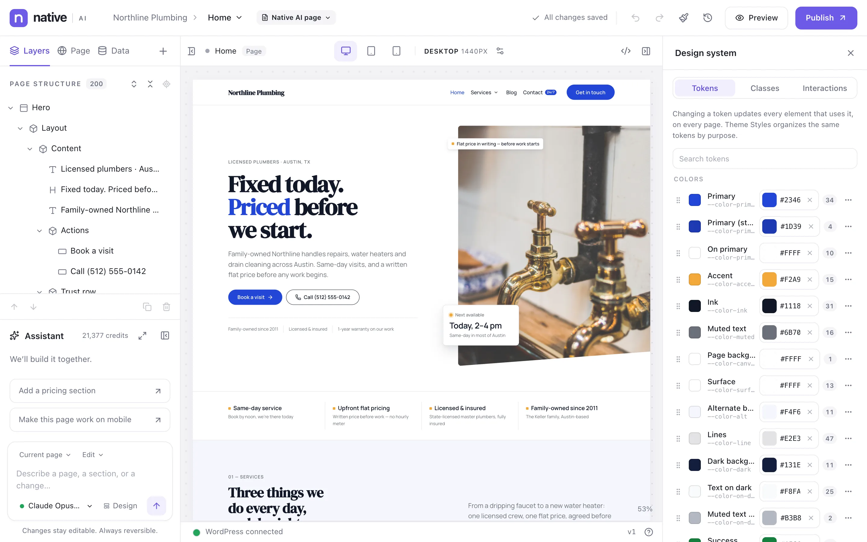
The design system panel lists every token with its value and how many places use it — so you know what a change will touch before you make it. Classes bundle styles into reusable names like .section, .eyebrow or .card, and elements can use several.
Changing a token updates every element that uses it, on every page. Interaction presets live here too.
- Usage count on every token
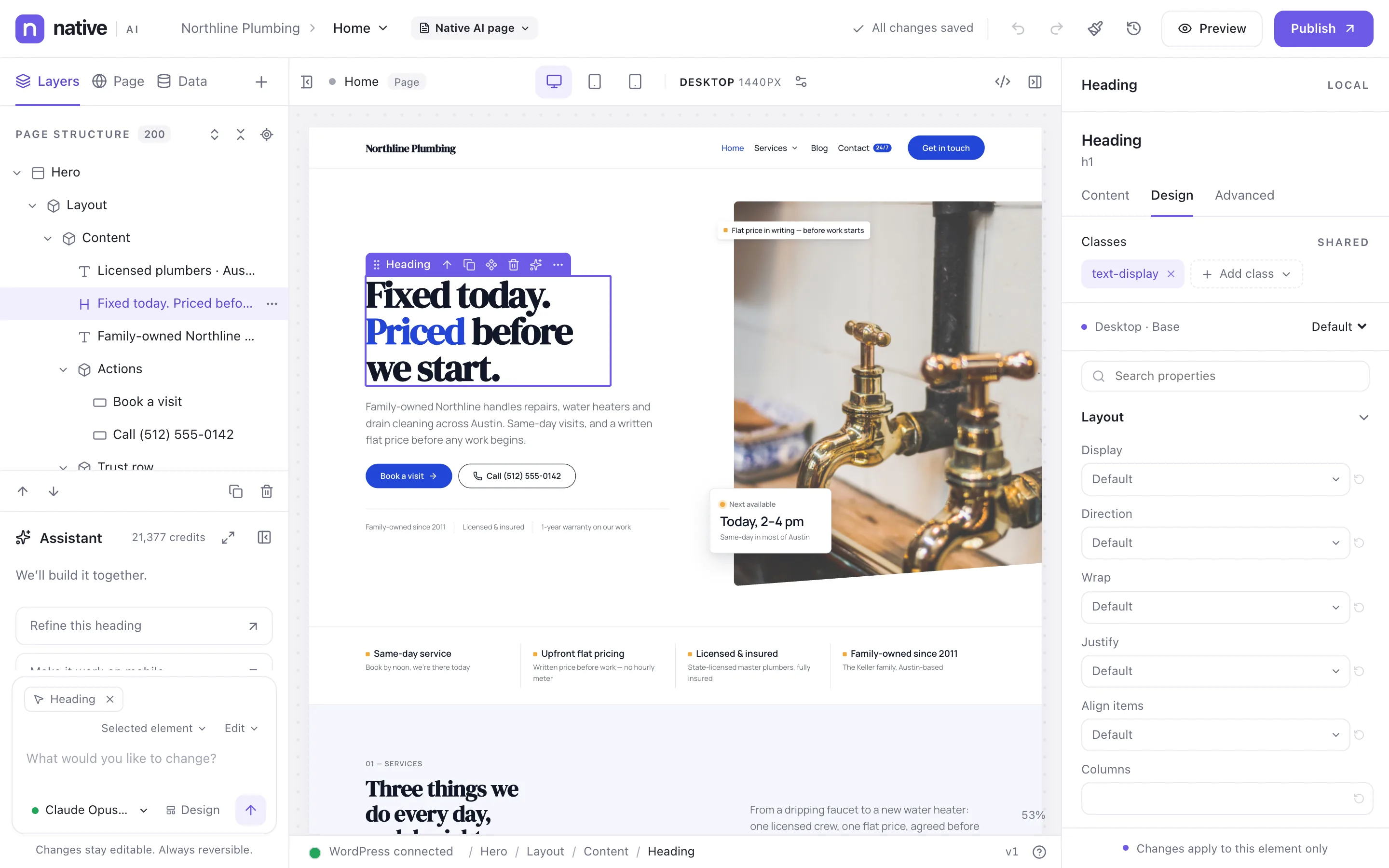
- Shared classes with a Local / Shared switch in the Design tab
- Interaction presets
Element defaults that stay out of your way
Set how headings, links, buttons, form fields, sections and cards, and lists look across the site. Elements start from these defaults, so a new button already looks like your buttons.
Dark sections adapt automatically: text, muted text, links and eyebrows switch to their on-dark colors inside a dark section.
- Headings H1–H6, links, buttons, forms, sections and cards, lists
- Defaults per element type
- Dark sections adapt text and links
Theme Styles & design systemEverything included
Everything in theme Styles & design system
Foundations
- Named color tokens by purpose
- Fonts: Google, system and uploaded
- Type scale with sizes, line heights and tracking
- Spacing scale and section padding
- Radius and shadow scales
- Containers and breakpoints
Reuse
- Design tokens with usage counts
- Global classes
- Element-type defaults (Theme Styles → Elements)
- Interaction presets
- Import and export settings
Working with AI
- The AI uses your tokens and classes
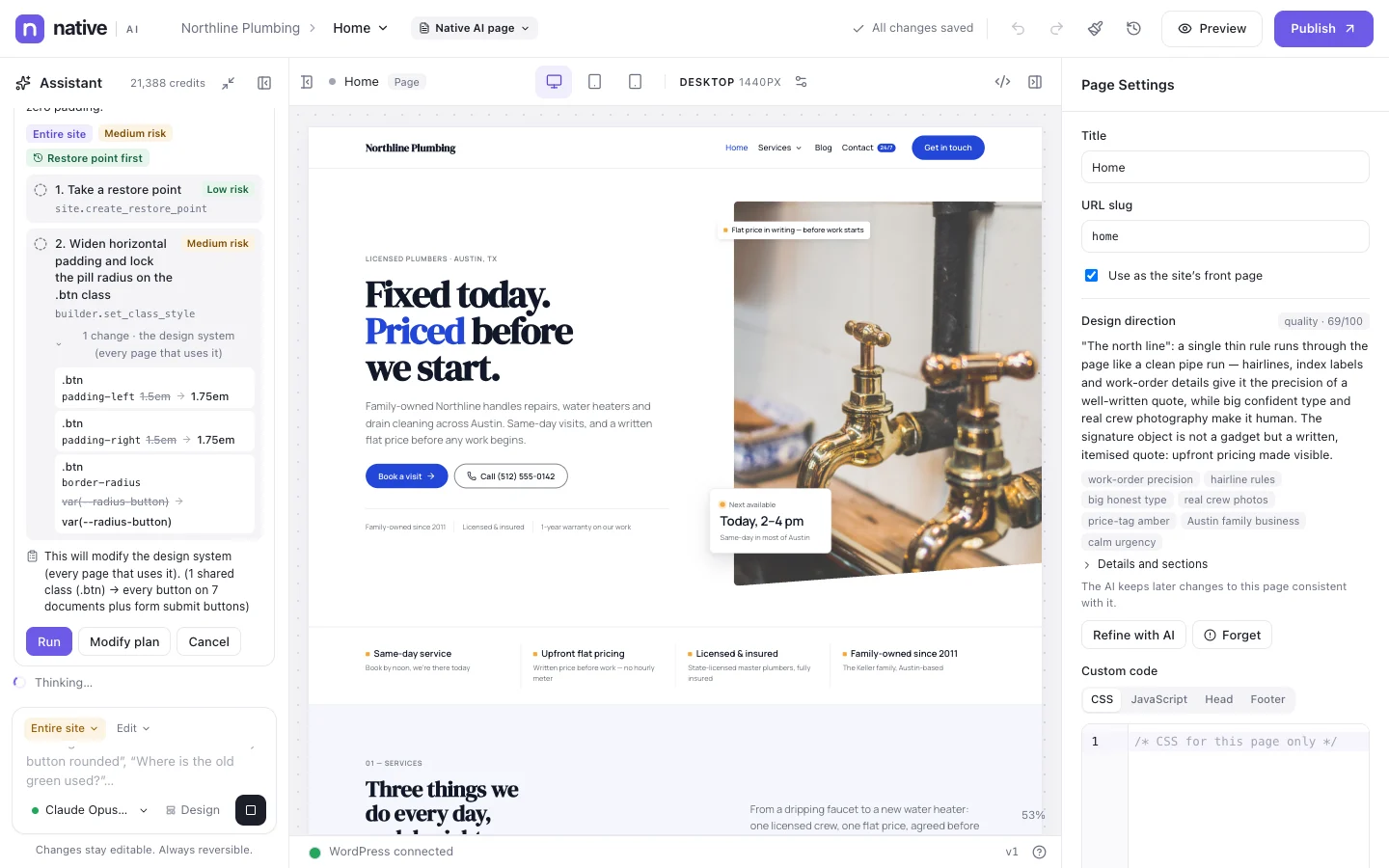
- Site-wide changes made at the Theme Styles or class level
- A design direction the AI keeps consistent
Questions about theme Styles & design system
Can I change the design system after the AI made it?
Of course. It’s your design system: edit tokens, classes and Theme Styles like any other part of the site, and the AI follows your changes in later requests.
Are Google Fonts loaded from Google?
Google Fonts you choose are loaded from Google’s servers. To serve a font from your own site instead, upload the font files in Theme Styles → Typography.
Works well with
Build your next WordPress site with AI you can edit.
Native AI is in early access. Tell us about your sites and we’ll set you up with a license.